Design: Nike Training Club app
Interaction & Micro interaction: Alex Vasyutin
ProtoPie • Lottie • After Effects • Figma
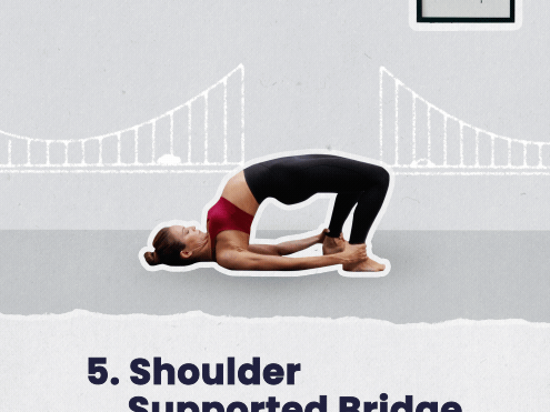
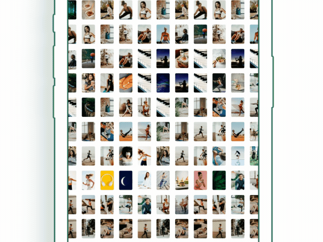
Nike Training Club is a fitness app. They made well-organized and effective content to help people be healthy taking into account different needs. I like it very much but some interactions might be improved.
So I took the risk of trying to improve the "one bar" of the NTC interface. I picked the Workout card for now.
What I've tried to achieve is creating less unexpected and frustrating interactions. In the original file, you can notice that:
• The bookmark on the Workout card doesn't relate to the page of Saved Workouts
• The Workout card has a default transition to the next page. It has a lack of continuity between the two states.
The design language of the NTC app is bold, effective, serious, and professional. It doesn't have fancy fireworks, mascots, bouncy elements. But it doesn't mean that it has to be less friendly.
The elements that respond to action are must-haves in my personal opinion. First thing, we have a default animation of the slide-in page over the content. Second thing, we have Workout cards that are close to each other and it is possible to move the wrong way by occasionally tapping on the beside card. Therefore, I have to customize this behaviour of interactions and transition to make them more consistent.
Ok, long story short, what I did:
• The bookmark is informative now. It guides the user's attention to the area where the bookmarks are stored, the Saved Workouts page.
• The Saved Workouts page is responding to user's interactions too. The bookmark on the Workouts card affects the icon of the Saved Workouts page.
• The Workout card has a depth while tapping and after release, it expands to the whole page. It makes consistency between the two states.
• The Workout page has an option to collapse while dragging. It supports the nature of the card and helps advanced users interact with the interface without stretching their thumb to the top left corner. (Unfortunately, the original UI isn't able to back the Workout page back to the previous screen while swiping)
• The Workout page is much more parallel with thought. It's redirectable :) It's possible to close it during expansion if you change your mind.
Here is a workflow: Save the workout to the bookmarks -> go to the Workout page -> remove the bookmark -> back to the start page.
Nike Training Club
Original
Nike Training Club
My Thoughts
This is a slow-motion demonstration of the ability to change your decision while the Workout card is expanding. You can test the prototype below, but it's best to do so on a mobile device using the ProtoPie app.
And now be my guest to test these versions below.
This prototype works better in Google Chrome or the ProtoPie app (Safari has a lag)

You can try to scan using ProtoPie app to launch the prototype.
Share you thoughts and critique to vasulden