Design: Fitbit app
Interaction & Micro interaction: Alex Vasyutin
ProtoPie • Figma • After Effects
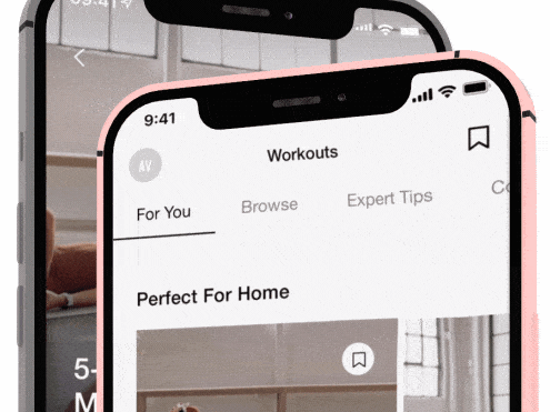
Fitbit is a fitness app (In this case). They are well known by Fitbit wearable devices and this app supports synchronization and storage of user's health data. Also, the Fitbit app provides a wide range of activities and tips to maintain the users' motivation.
The helpful app doesn't mean it has good motion language. I won't rethink the language of the app but I'll take a risk of trying to improve the "one bar" of the Fitbit interface animation. I picked the Transition after some filters were applied and a 'Save to favourites' action.
What I've tried to achieve is creating less unexpected and frustrating interactions. In the original file, you can notice that:
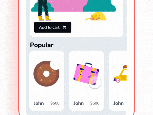
• The 'Save to Favorite' icon (Star) on the Workout card doesn't really relate to the 'Favorites' Page
• The Workout card has a default transition to the next page. It has a lack of continuity between the two states.
The action responded elements are must-haves in my personal opinion. We don't see a response to the Favorites tab that gathered saved workouts. And it's an uncertain thing how to get there to that 'Favorites Page' because every digital product has its own place to store saved stuff. So I thought it might be better to help the user from the start.
Moreover, I customized the interaction and transition of a selected tab on the Filter bar to make them more consistent. The whole transition is forward to continuity now.
Ok, long story short, what I did:
• The 'Favorites' page is responding to user's interactions. The 'Save to Favorites' icon on the Workouts card affects the Favorites tab. It grabs our attention to inform us about the placement of a saved item.
• The 'Abs & Core' tab responds with colour while tapping. It makes the interface friendlier because of feedback. Otherwise, the way you'll get a habit of waiting for action from non-action UI elements because they simply don't respond visually.
• Transition follows the Filter bar. Pushing the 'Abs & Core' button you're giving the impulse for the Filter bar. This one drags the Workout cards and transfers that force to the Page title.
Some Challenges: The 'Favorites' tab has quite small elements (the top left part of the screen) to grab the user's attention while tapping the 'Save' icon on a Workout card (The middle right part of the screen ). I tried to solve it by transforming the filled shape of the tab to a stroke to increase the overall page contrast. I added a pretty active animation of a blinked Star above the tab. I guess this method solves it mostly.
Here is a workflow: Save the workout to the bookmarks -> remove the bookmark -> go to the 'Abs & Core' page -> back to the start page.
Fitbit App
Original
Fitbit App
My Thoughs
And now be my guest to test these versions below.
This prototype works better in Google Chrome or the ProtoPie app (Safari has a lag)
Share you thoughts and critique to vasulden